Delhi
*
08:36:54

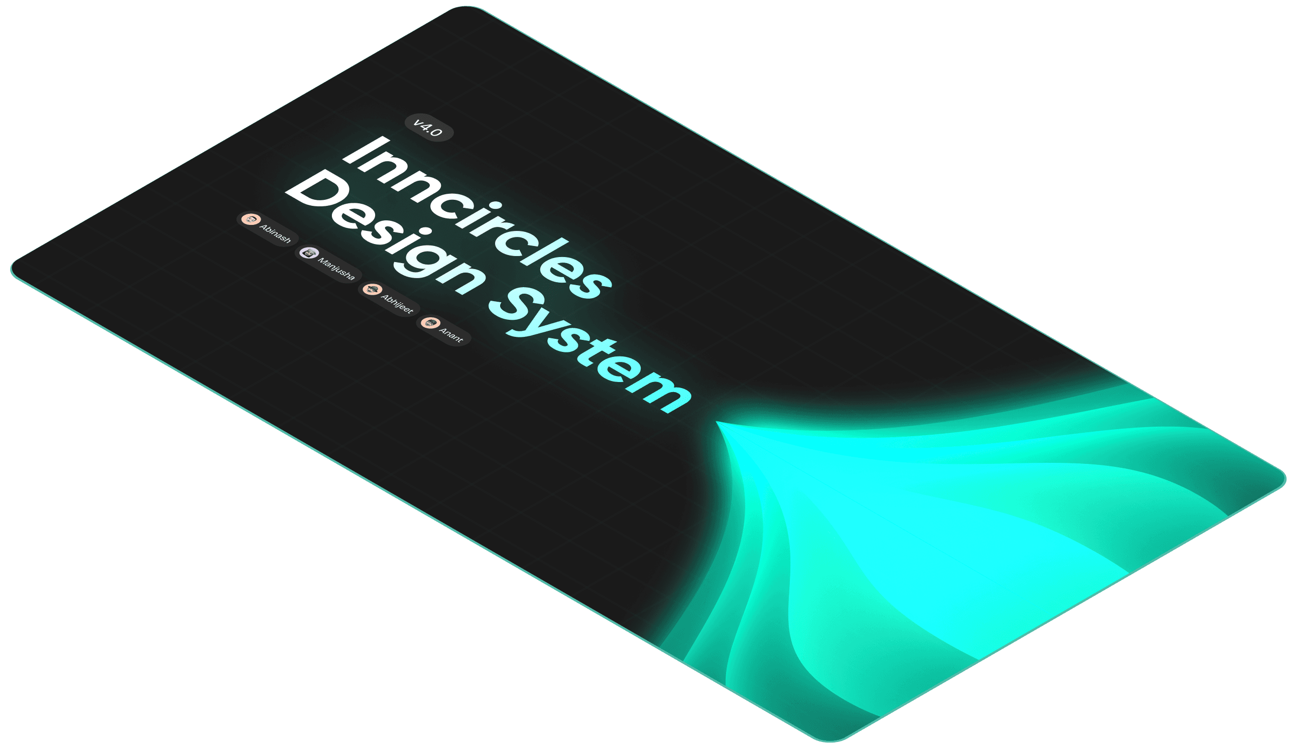
Inncircles Design System 4.0
Inncircles Design System 4.0
We built a design system to keep our product consistent and easy to manage. It gives the team one clear place to follow for design decisions. It helps everyone work faster, stay on the same page, and keep the whole product looking and feeling the same.
Admin Panel serves as a centralised hub for managing user access, settings, and activity across multiple integrated AI platforms, including InnClock AI, InnDoc AI, InnForm AI and Inndrive AI.
We built a design system to keep our product consistent and easy to manage. It gives the team one clear place to follow for design decisions. It helps everyone work faster, stay on the same page, and keep the whole product looking and feeling the same.
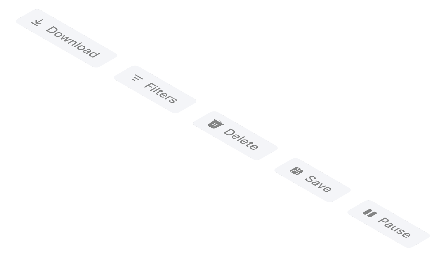
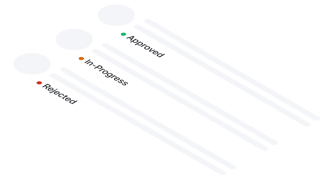
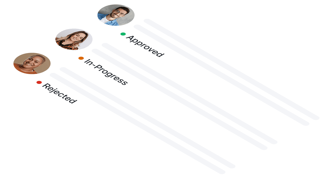
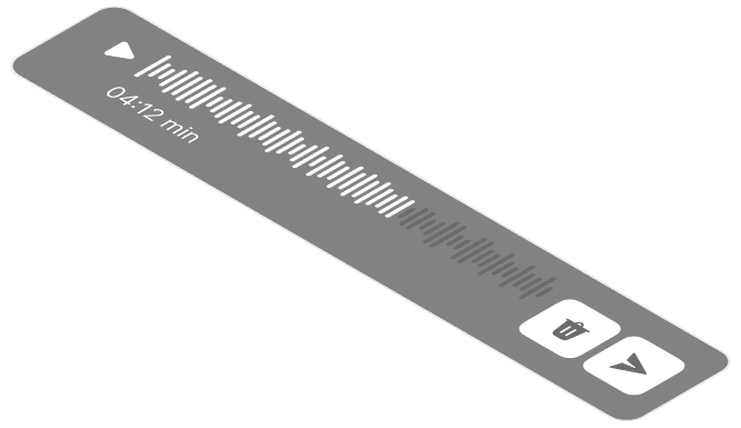
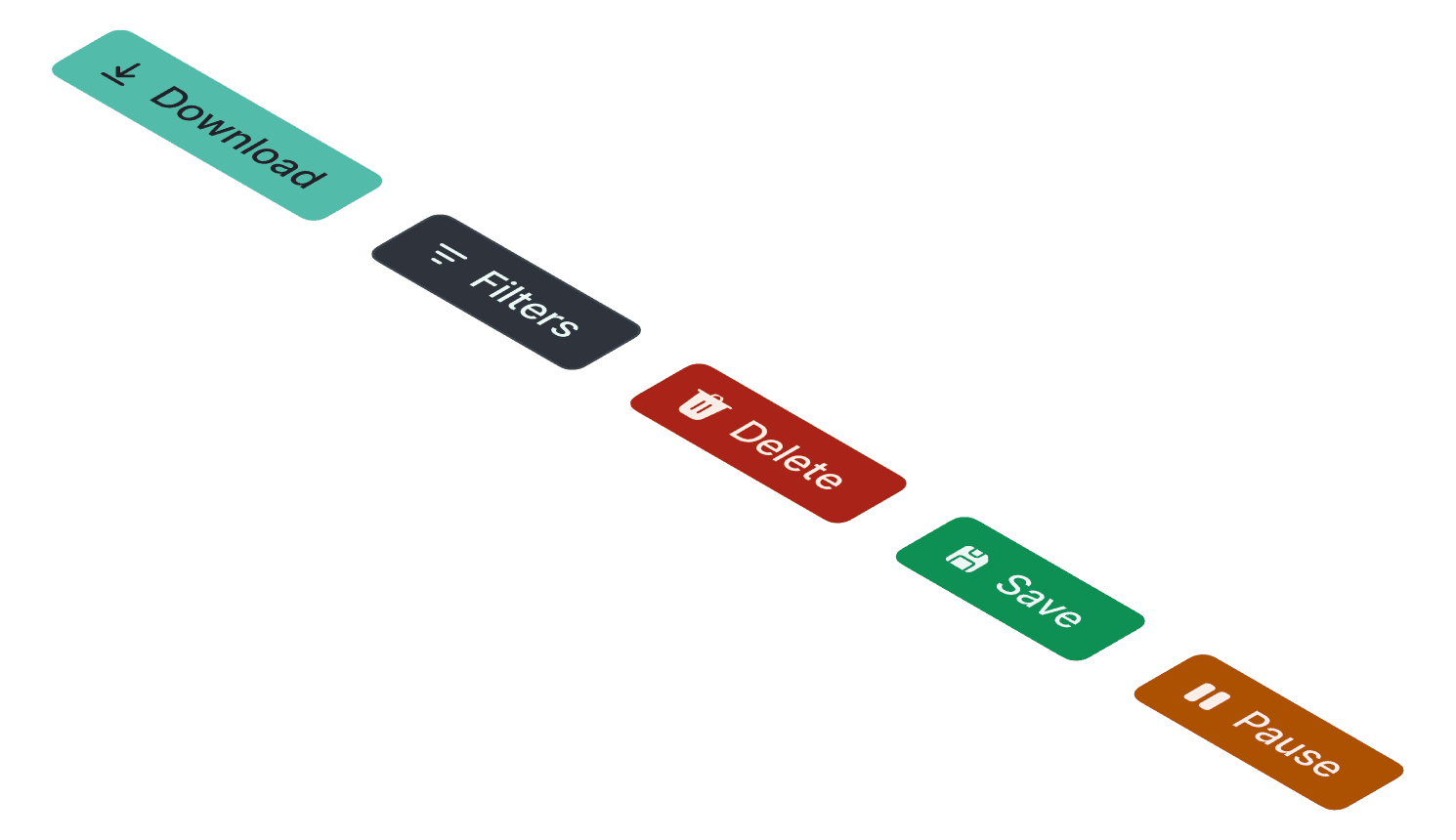
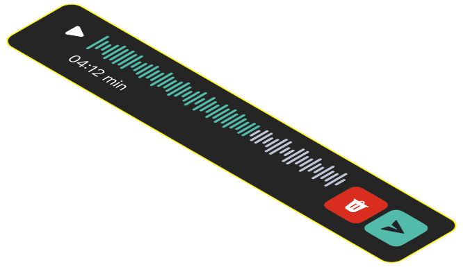
" Create your Global & Local Component! "
" Create your Global & Local Component! "
" Easy to customise"
Why build a design system?
Why build a design system?
In our fast startup, quick shipping led to inconsistent designs — screens and components varied, making it hard to track what worked. We fixed this with a design system, one clear source of truth for UI patterns. It keeps the team aligned, enables reuse, and speeds us up without losing consistency.
In our fast startup, quick shipping led to inconsistent designs — screens and components varied, making it hard to track what worked. We fixed this with a design system, one clear source of truth for UI patterns. It keeps the team aligned, enables reuse, and speeds us up without losing consistency.
In our fast startup, quick shipping led to inconsistent designs — screens and components varied, making it hard to track what worked. We fixed this with a design system, one clear source of truth for UI patterns. It keeps the team aligned, enables reuse, and speeds us up without losing consistency.
Whats Inside
Whats Inside
A unified system of reusable foundations and components that brings clarity, consistency and structure to every interface
A unified system of reusable foundations and components that brings clarity, consistency and structure to every interface
A unified system of reusable foundations and components that brings clarity, consistency and structure to every interface
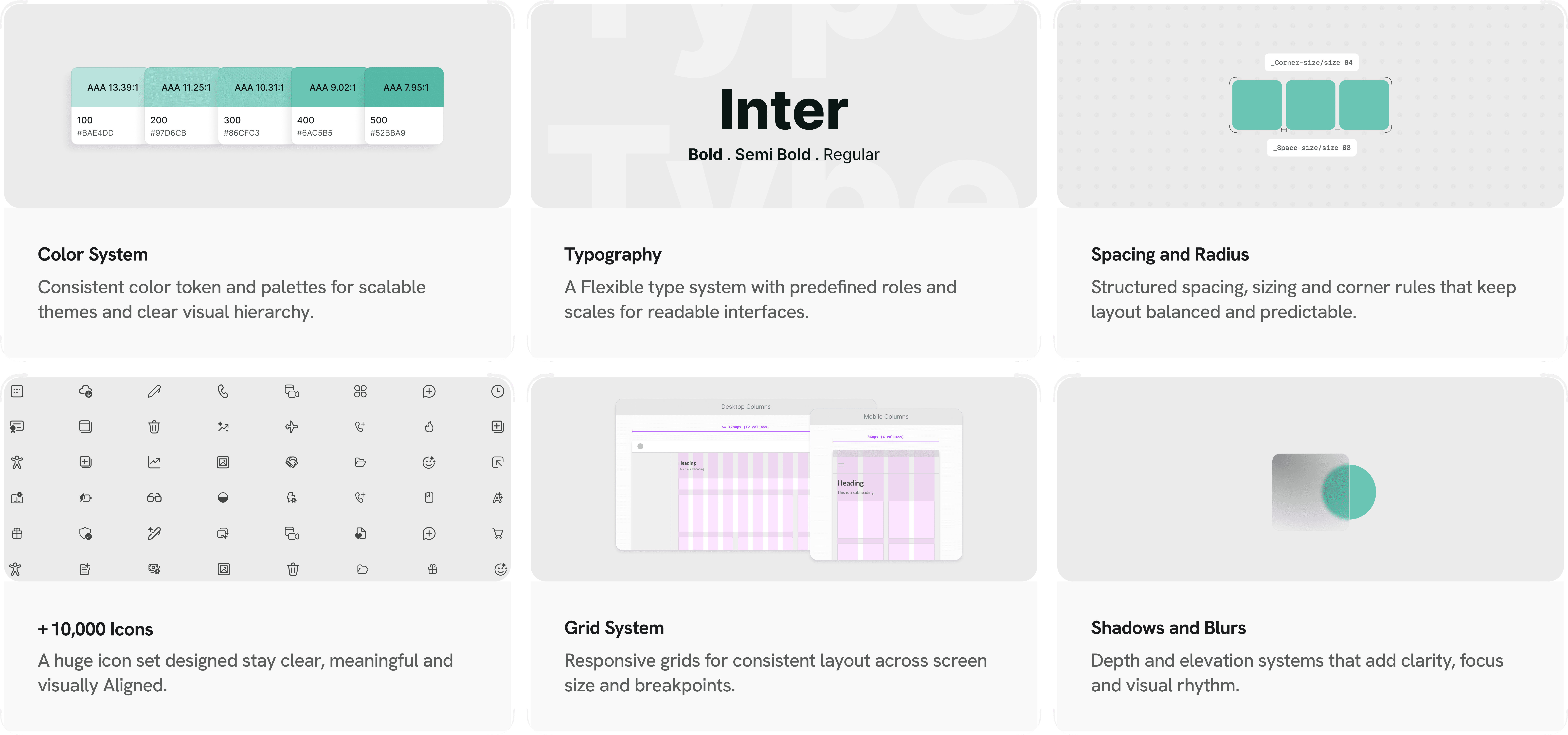
…and much more foundations and components.
…and much more foundations and components.
…and much more foundations and components.
Atomic Design Principles
Atomic Design Principles
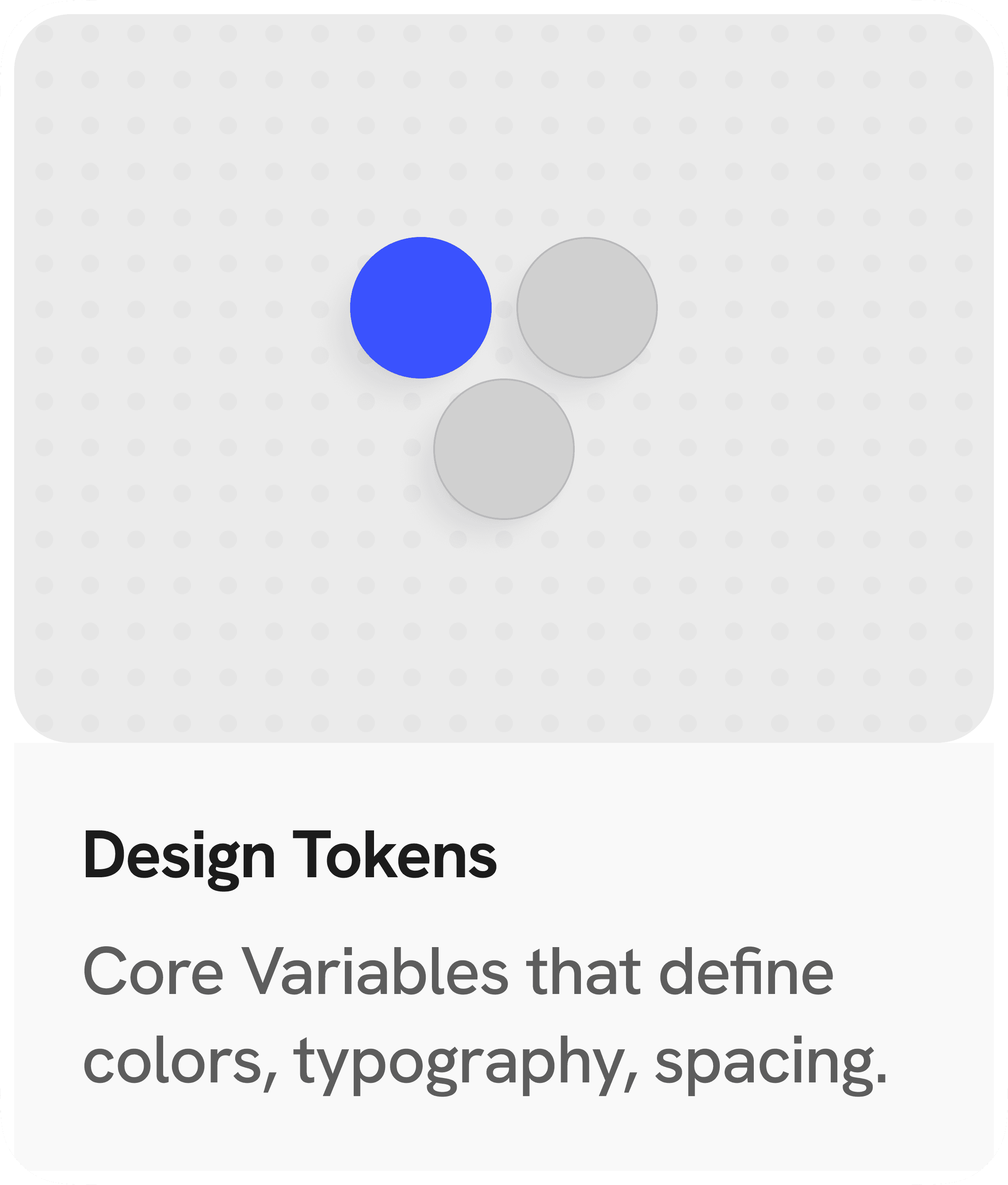
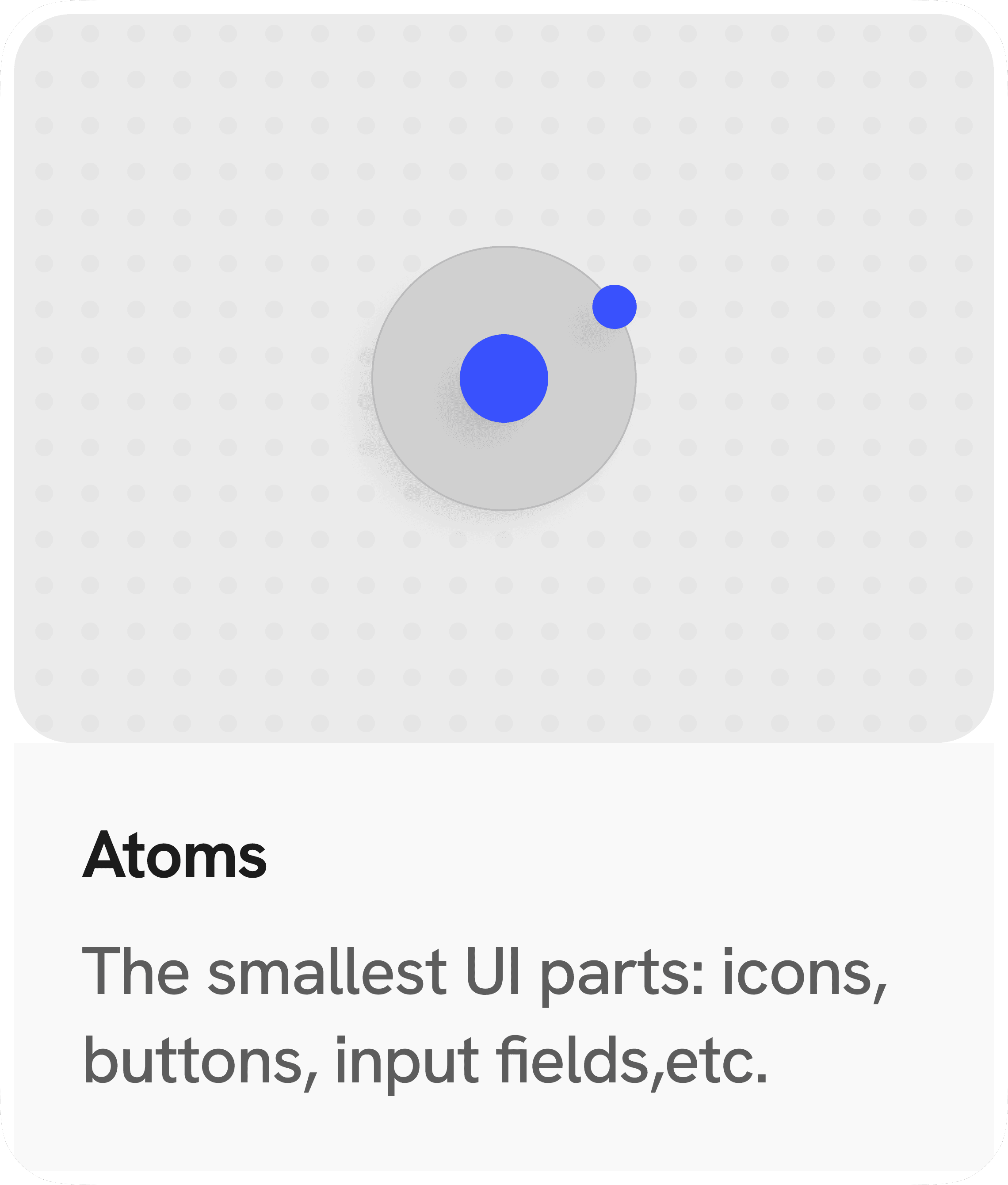
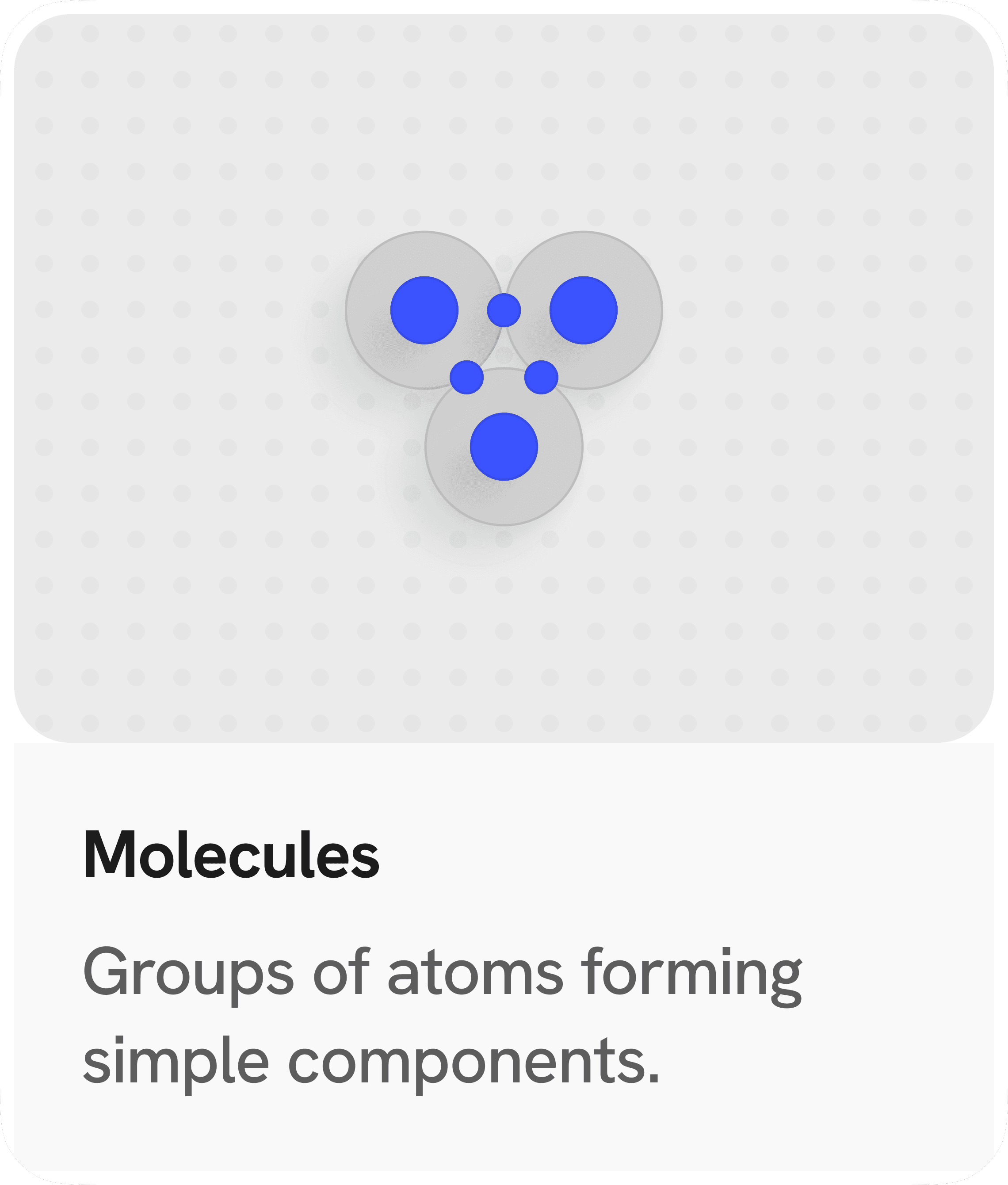
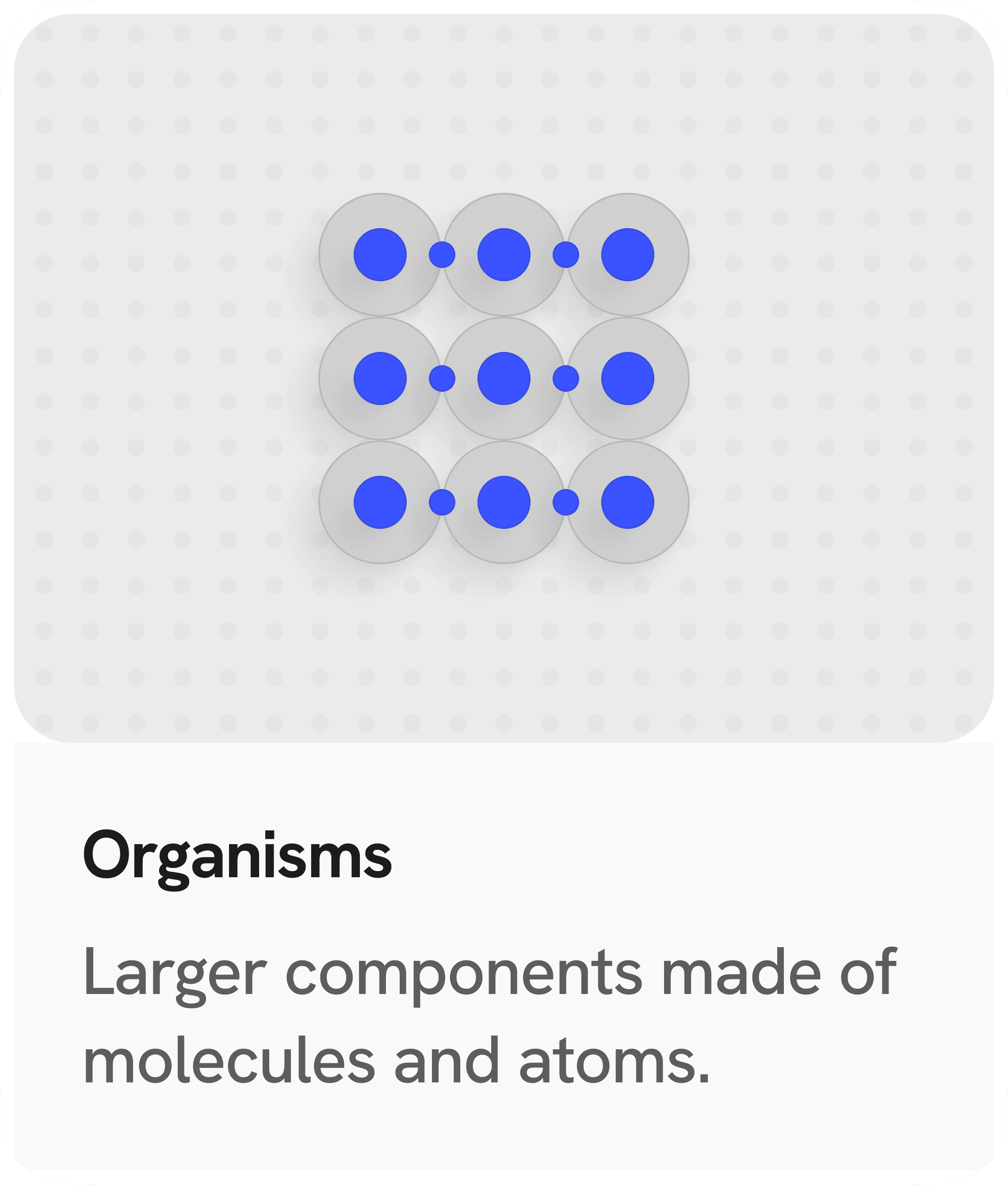
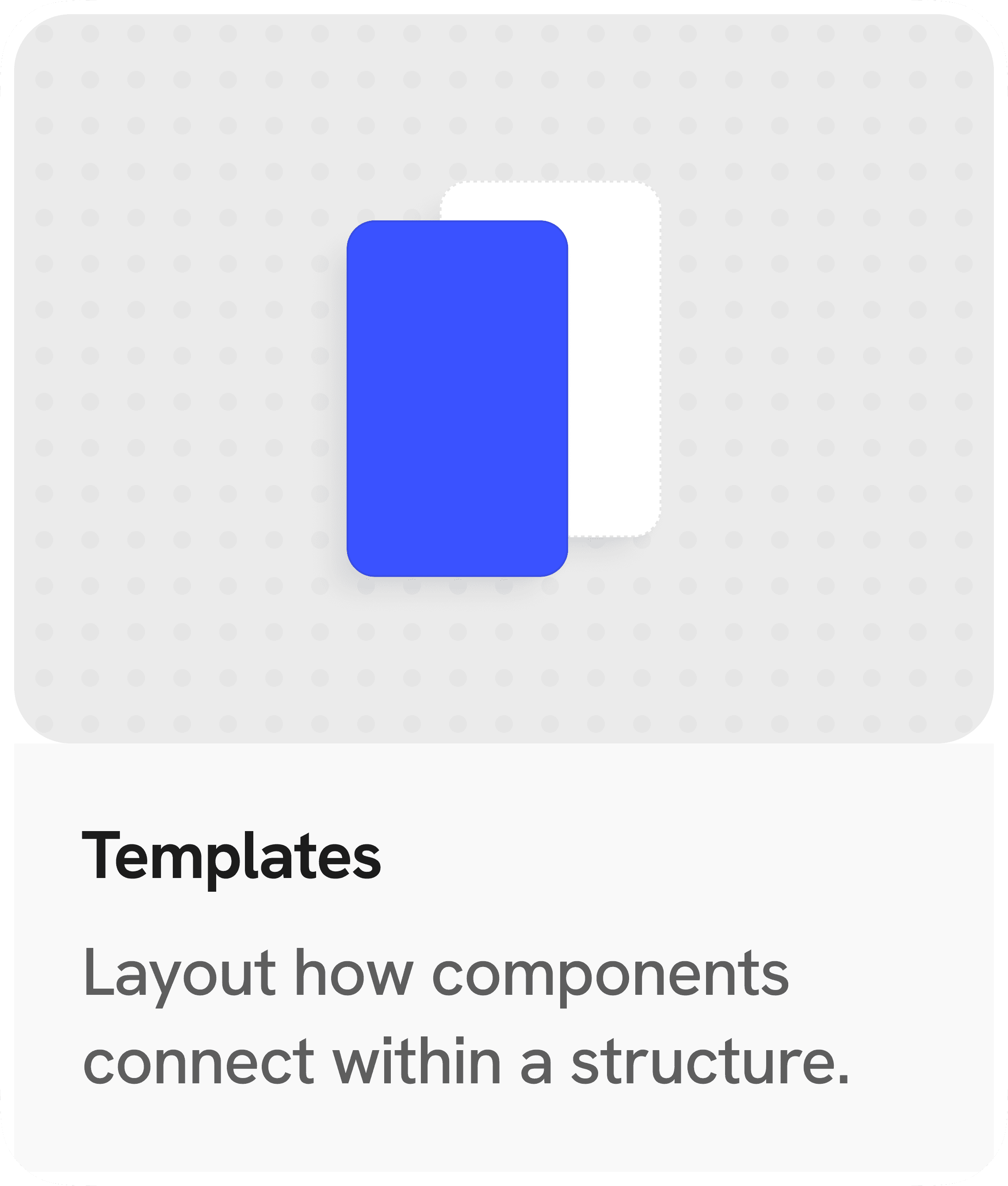
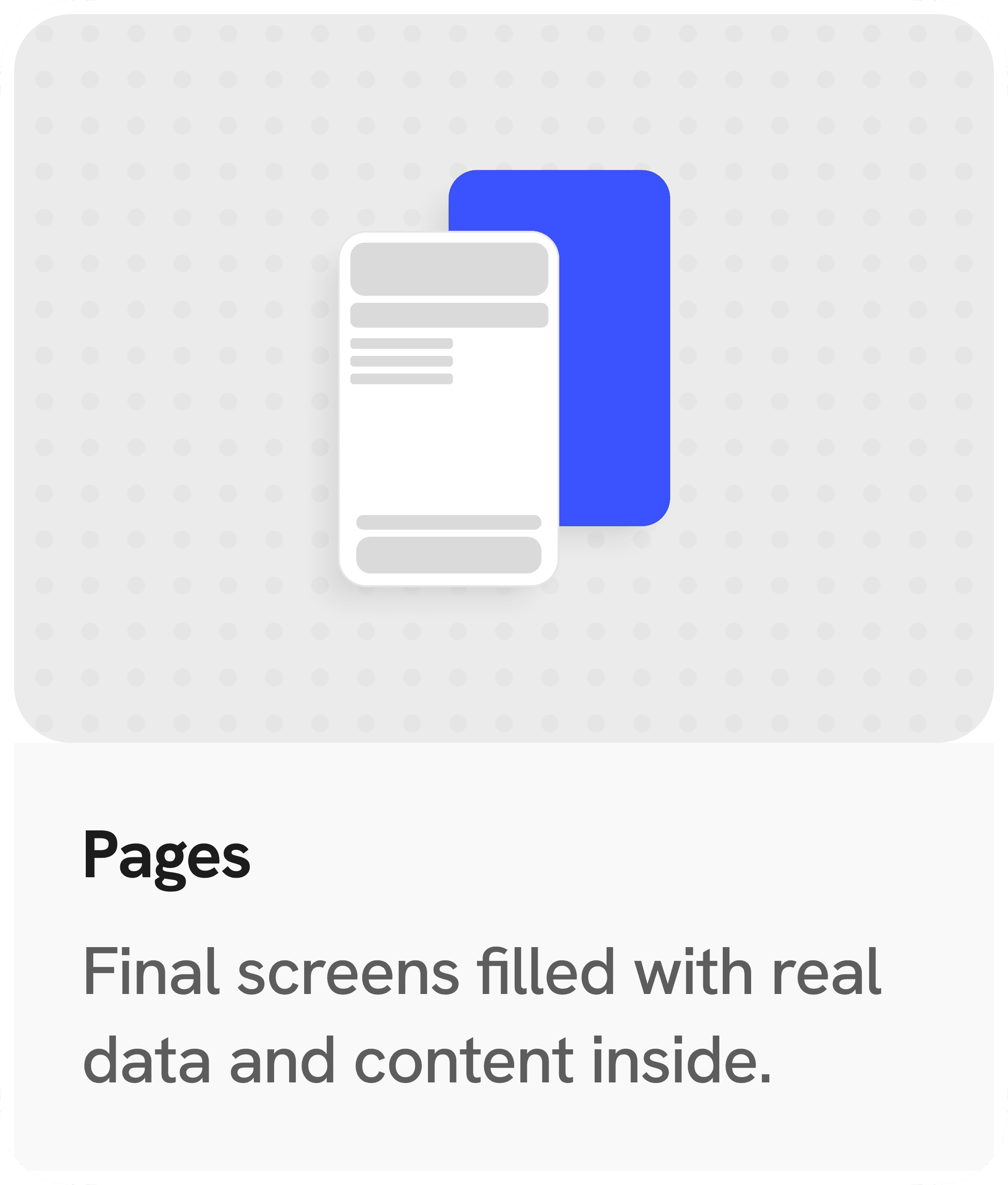
Atomic Design is a modular approach that breaks interfaces into reusable pieces, making their structure clear and connected. And we revisited our core elements, adjusted what wasn’t working, and aligned key parts with common industry standards. This gave us a solid base so everything built on top stayed consistent, scalable, and easy to maintain over time.
Atomic Design is a modular approach that breaks interfaces into reusable pieces, making their structure clear and connected. And we revisited our core elements, adjusted what wasn’t working, and aligned key parts with common industry standards. This gave us a solid base so everything built on top stayed consistent, scalable, and easy to maintain over time.
Atomic Design is a modular approach that breaks interfaces into reusable pieces, making their structure clear and connected. And we revisited our core elements, adjusted what wasn’t working, and aligned key parts with common industry standards. This gave us a solid base so everything built on top stayed consistent, scalable, and easy to maintain over time.
Consistency
Consistency
Consistency
Scalable
Scalable
Scalable
Maintainable
Maintainable
Maintainable
Code-friendly
Code-friendly
Code-friendly
Inspiration
Inspiration
We drew inspiration from leading B2B SaaS design systems to shape ours.
We drew inspiration from leading B2B SaaS design systems to shape ours.
We drew inspiration from leading B2B SaaS design systems to shape ours.




Scalable Token Names
Scalable Token Names
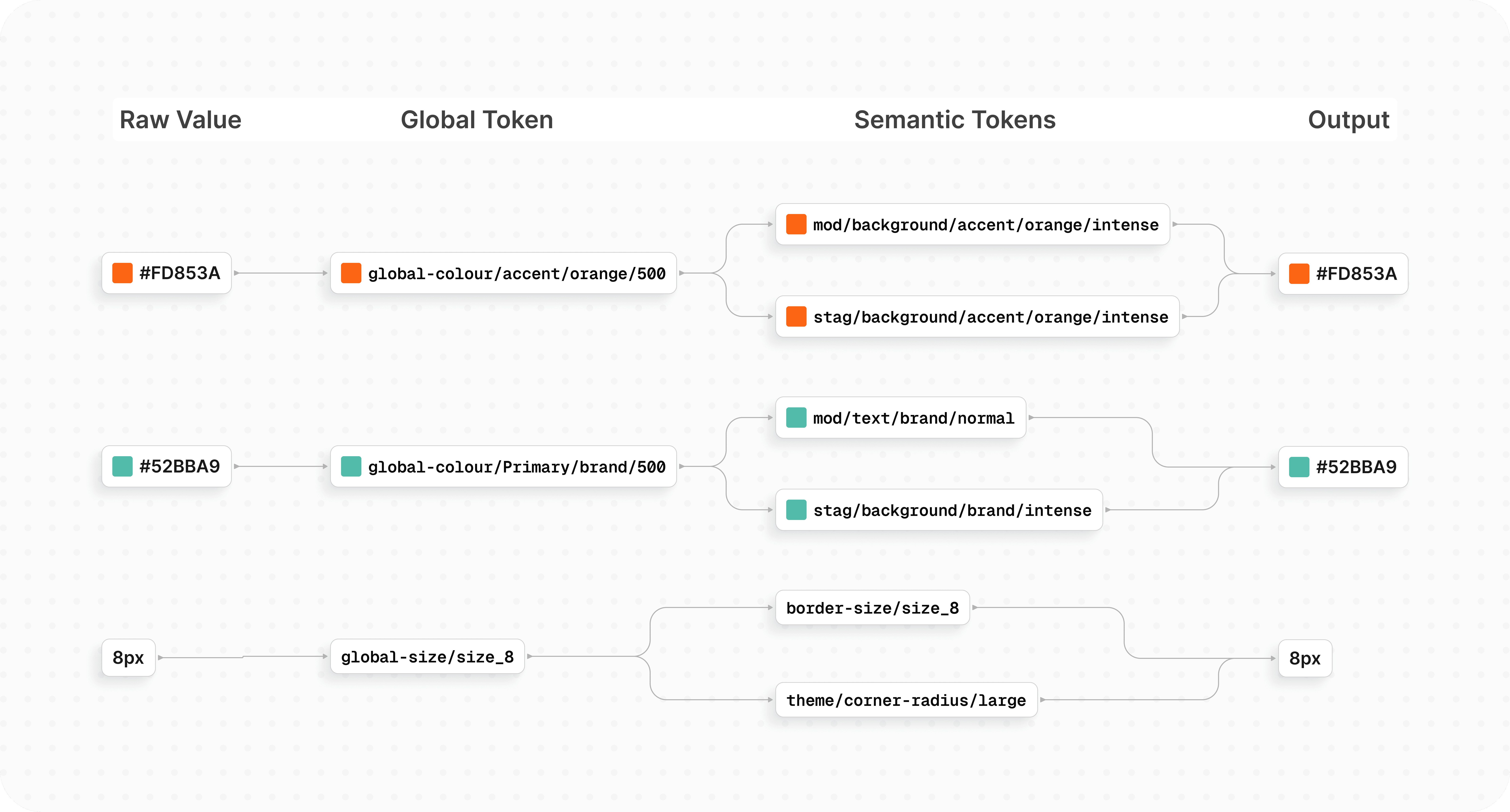
We organised semantic tokens into two types: Stage and Mode.
Stage tokens are for static elements, while Mode tokens are for interactive ones, making it
easier for the team to choose the right tokens and keep the system scalable and clear.
We organised semantic tokens into two types: Stage and Mode.
Stage tokens are for static elements, while Mode tokens are for interactive ones, making it
easier for the team to choose the right tokens and keep the system scalable and clear.
We organised semantic tokens into two types: Stage and Mode.
Stage tokens are for static elements, while Mode tokens are for interactive ones, making it easier for the team to choose the right tokens and keep the system scalable and clear.
Smart Components
Smart Components
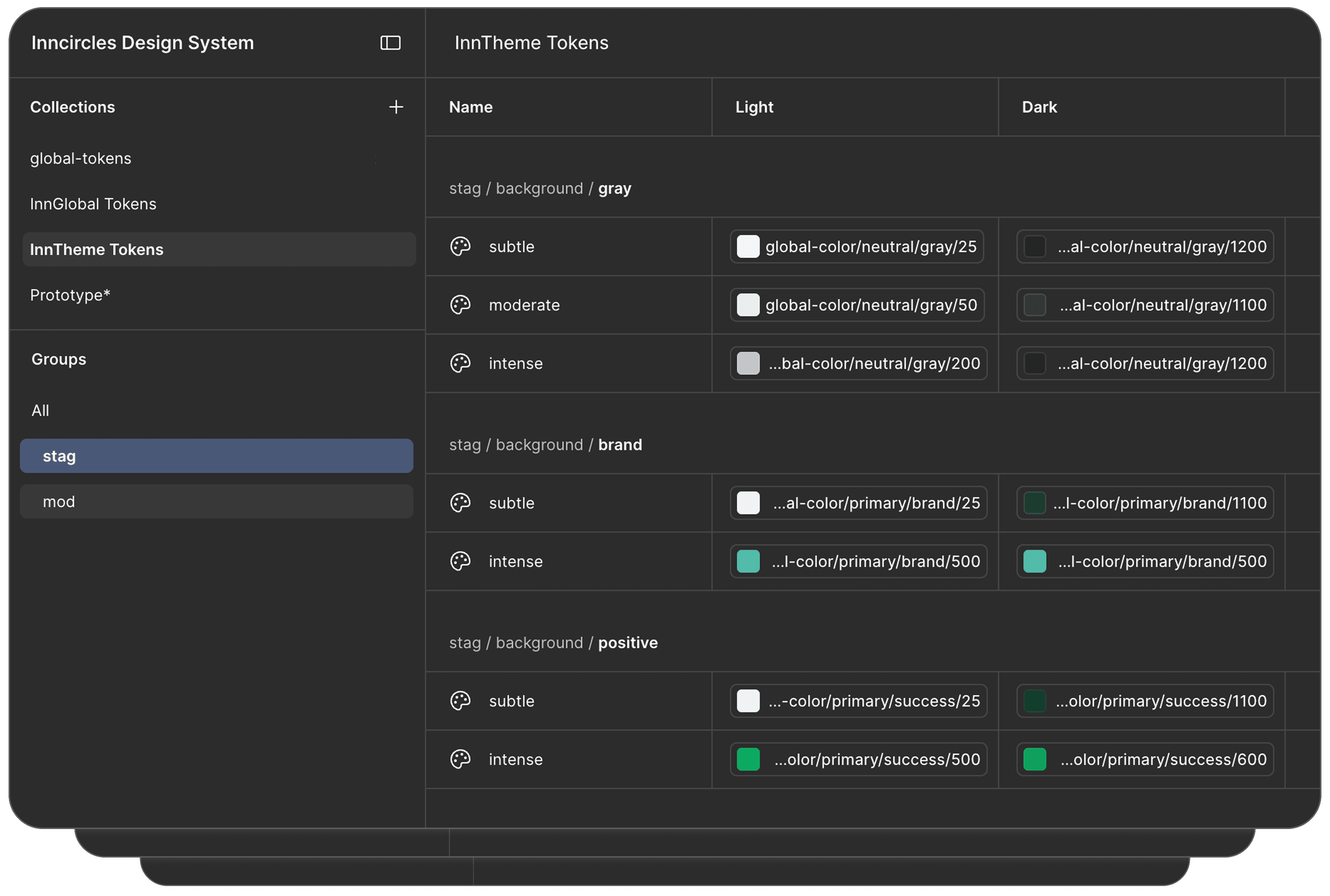
Smart components automatically adjust to different states, themes, and content by using variables and simple logic, reducing manual effort and keeping designs consistent.
Smart components automatically adjust to different states, themes, and content by using variables and simple logic, reducing manual effort and keeping designs consistent.
Smart components automatically adjust to different states, themes, and content by using variables and simple logic, reducing manual effort and keeping designs consistent.
Color System
Color System
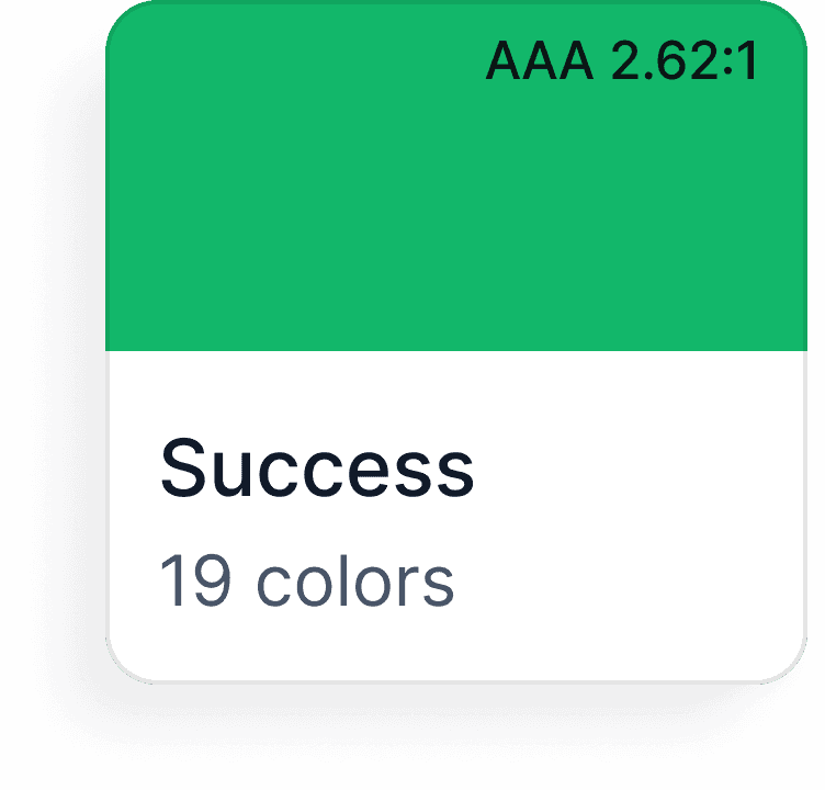
A flexible palette of semantic and functional colours that keeps interfaces consistent, clear and expressive across the entire product.
A flexible palette of semantic and functional colours that keeps interfaces consistent, clear and expressive across the entire product.
A flexible palette of semantic and functional colours that keeps interfaces consistent, clear and expressive across the entire product.
Primary Color
Primary Color
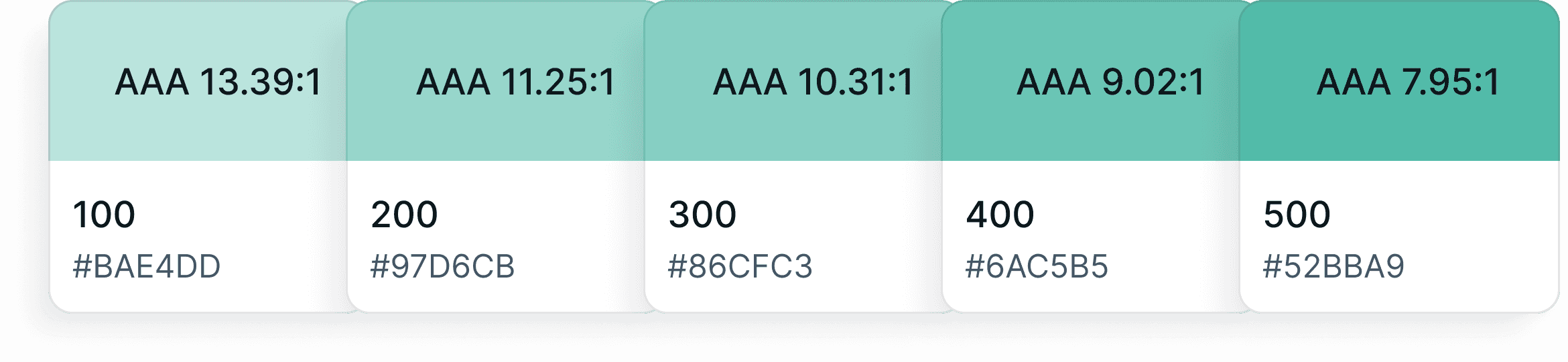
The brand color is our "primary" color, and is used across all interactive elements such as buttons, links, inputs, etc. This color can define the overall feel and can elicit emotion.
The brand color is our "primary" color, and is used across all interactive elements such as buttons, links, inputs, etc. This color can define the overall feel and can elicit emotion.
The brand color is our "primary" color, and is used across all interactive elements such as buttons, links, inputs, etc. This color can define the overall feel and can elicit emotion.
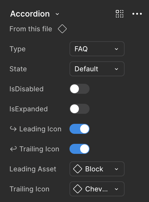
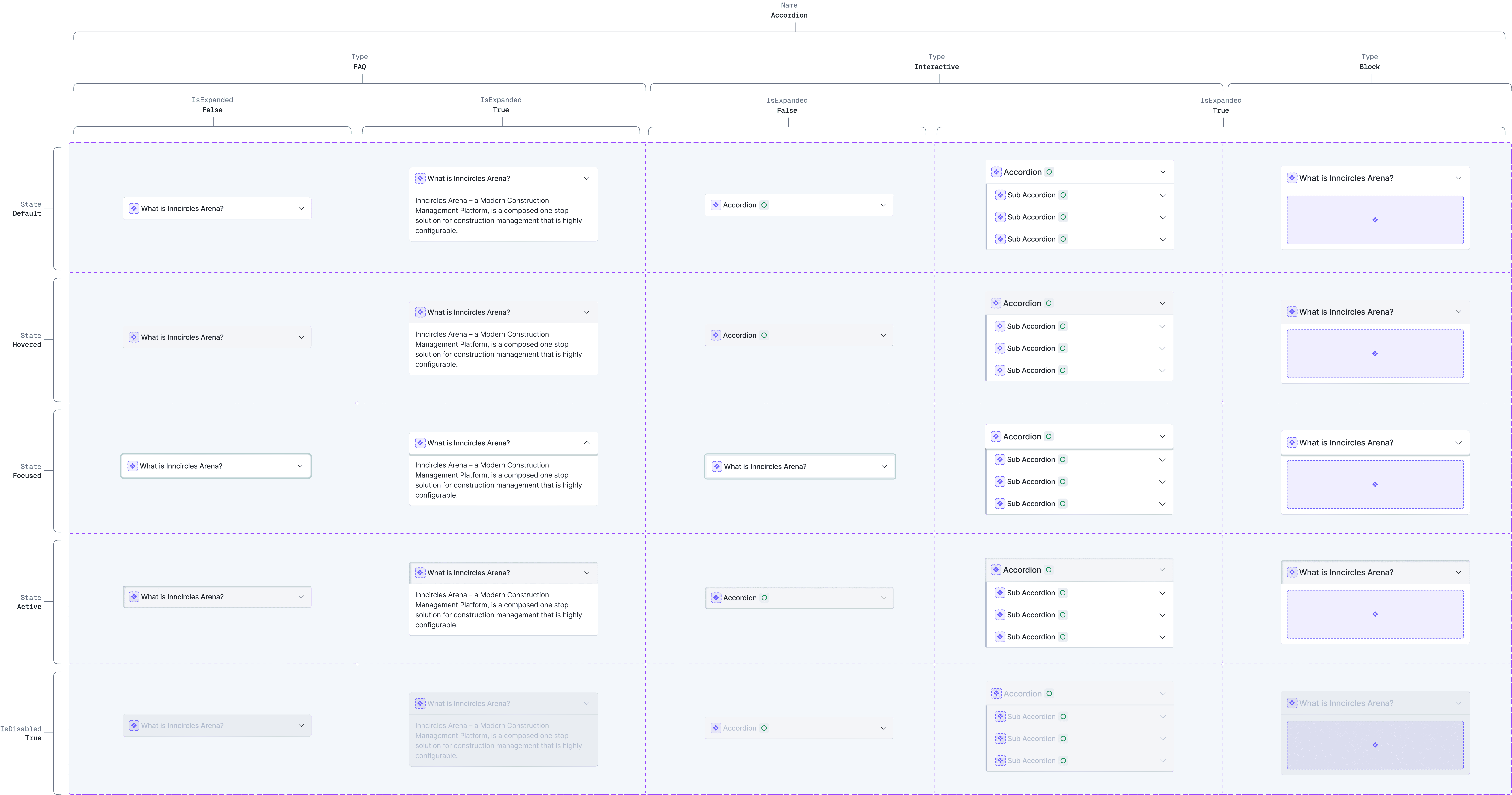
Structure and Anatomy of Components
Structure and Anatomy of Components
Structure, properties, states, and variants, ensuring reusable, scalable UI elements with consistent behavior, layout, and visual hierarchy across systems.
Structure, properties, states, and variants, ensuring reusable, scalable UI elements with consistent behavior, layout, and visual hierarchy across systems.
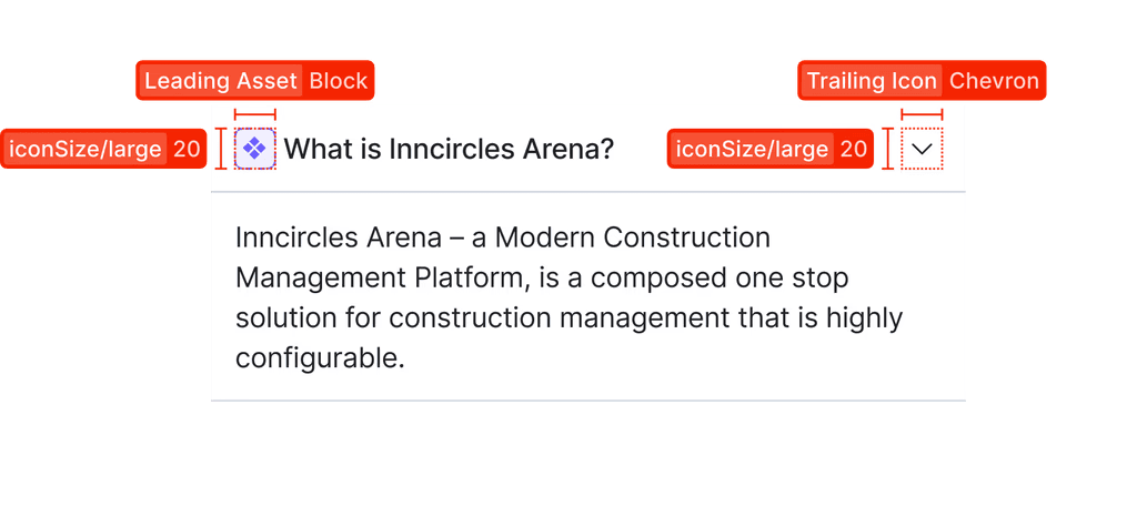
Structure of Component
Structure of Component
Anatomy of Component
Anatomy of Component
Component Variants
Component Variants
UI Components
UI Components
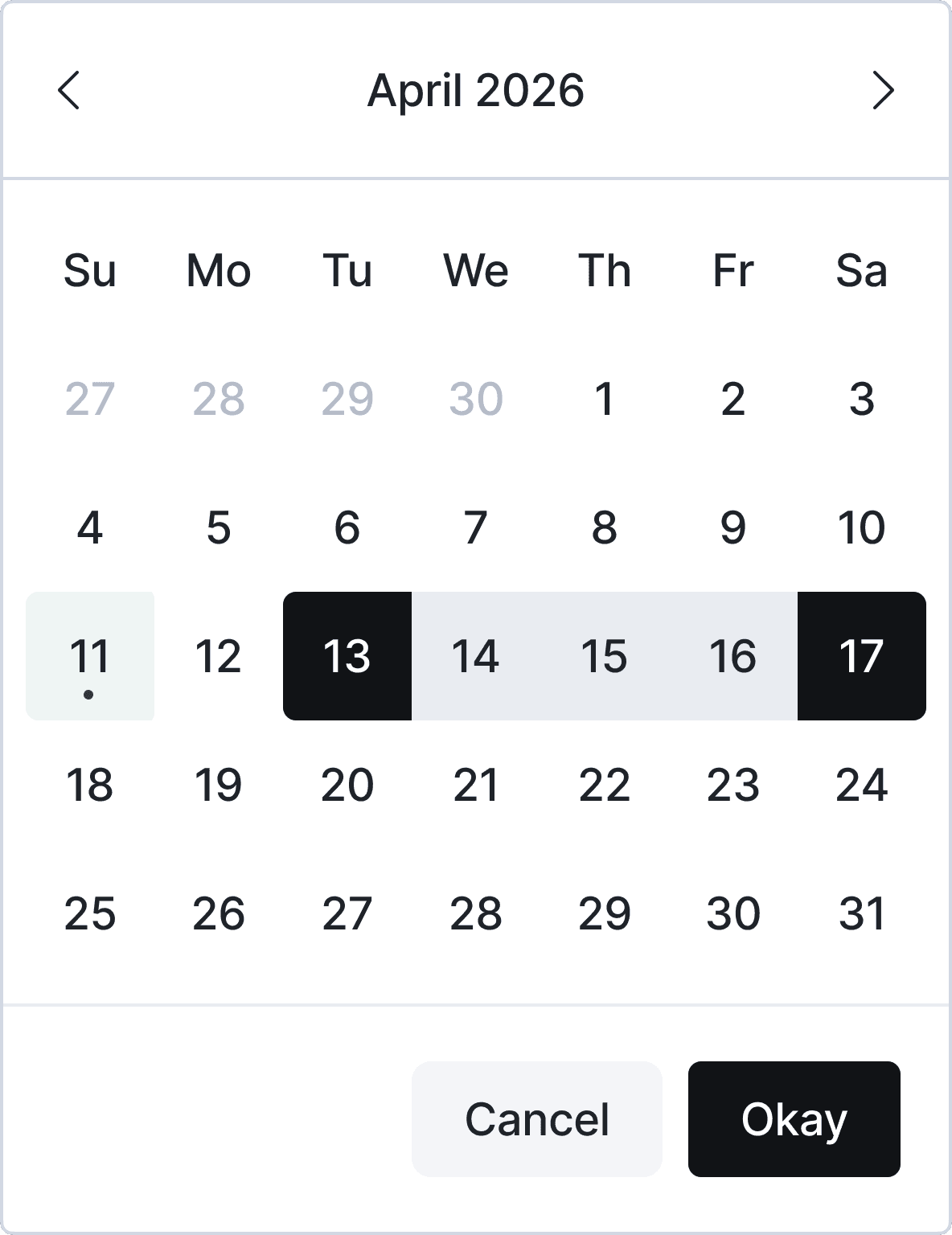
A library of essential UI components built on shared tokens and properties, ensuring consistent spacing, sizing, and states. Complex components combine simpler ones, with automatic adaptation for dark mode including colors, contrast, and shadows.
A library of essential UI components built on shared tokens and properties, ensuring consistent spacing, sizing, and states. Complex components combine simpler ones, with automatic adaptation for dark mode including colors, contrast, and shadows.
Light
Dark
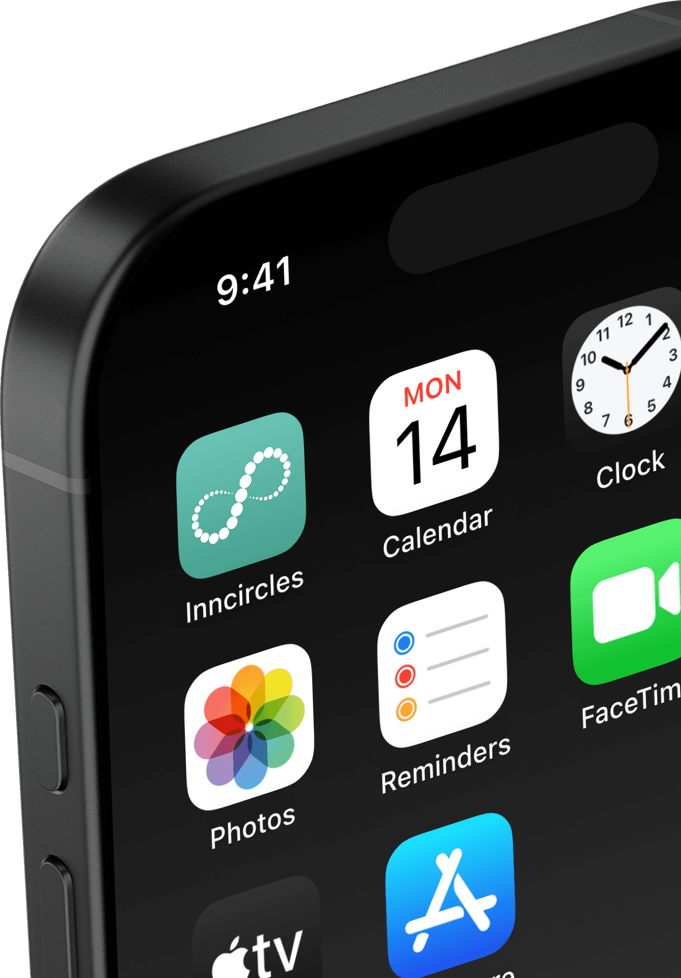

Behind every great design, there's a great team.
Behind every great design, there's a great team.
My Role
My Role
My Role
Product Designer
Product Designer
Product Designer
Duration
Duration
Duration
Aug'2024-Still Going On
Aug'2024-Still Going On
Aug'2024-Still Going On
Team
Team



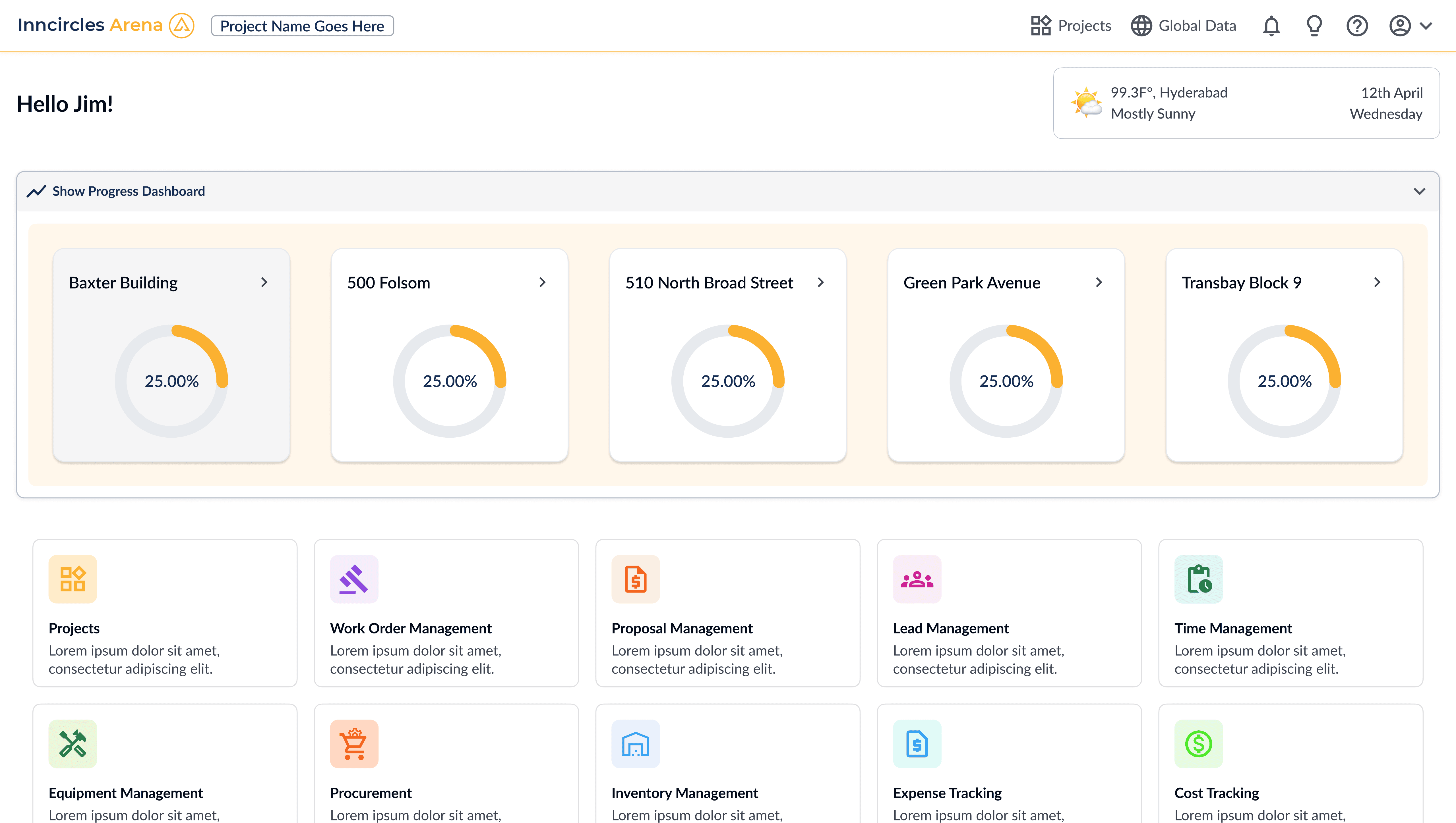
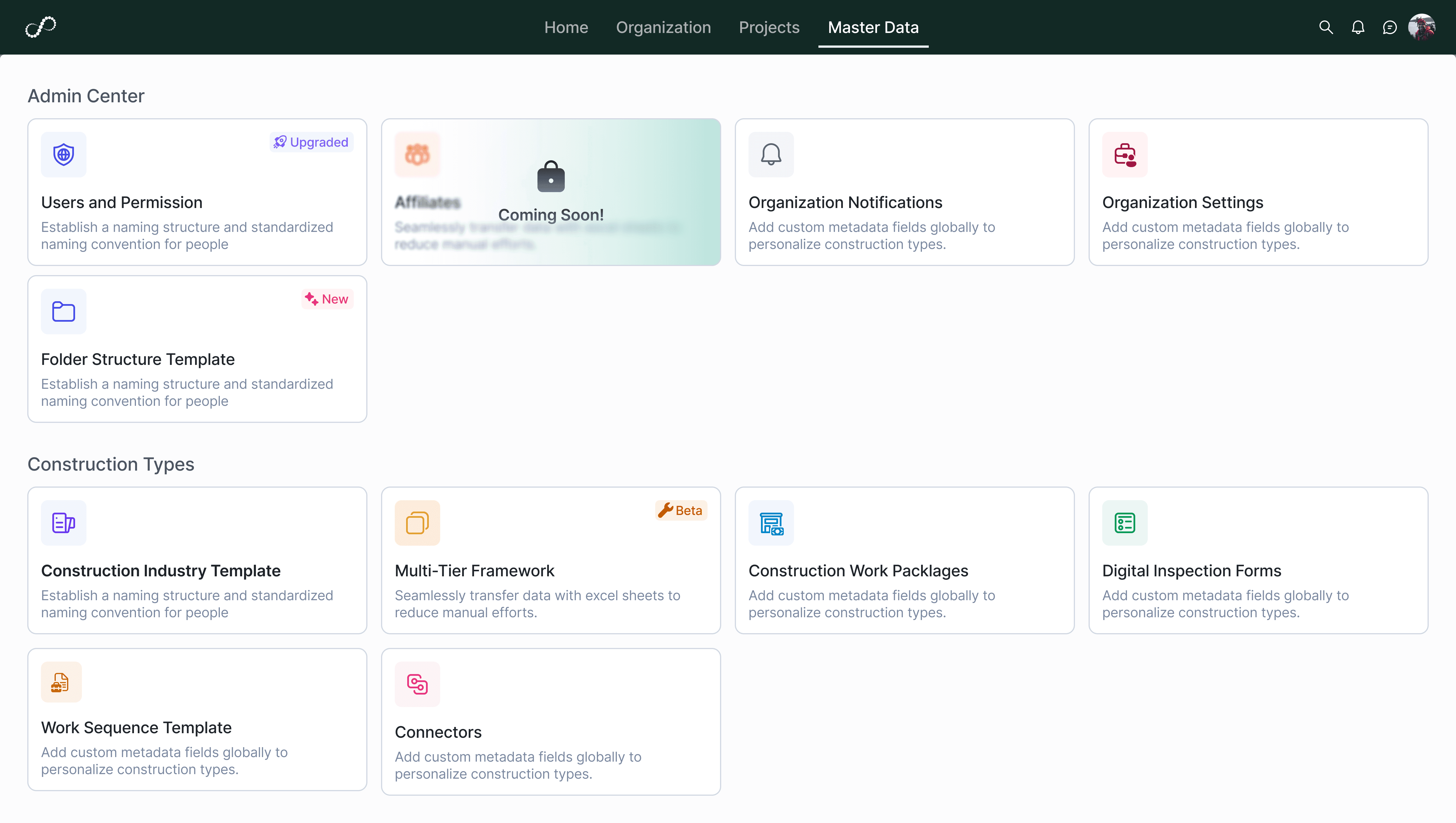
Comparision
Comparision

Let's create cool things together!

A Product designer who listens, understands your needs, and delivers with care.
If you liked this you would also like —
Let's create cool things together!
A Product designer who listens, understands your needs, and delivers with care.
If you liked this you would also like —
Let's create cool things together!
A Product designer who listens, understands your needs, and delivers with care.
If you liked this you would also like —